2) How effective is the combination of your main product and ancillary texts?
We think the combination of our three products (music video, web page and digi pack) works really well together as we kept the same themes running continuously throughout all of them and kept a lot of the same motifs so they all related to each other.
For example, our three products relate together as we used some of the same imagery and themes which you can see below:
The famous alphabet spaggetti scene in our music video :)
 |
| Image of the spaghetti on our disc in the digi pack design. |
|
| Spaghetti image on our web page |
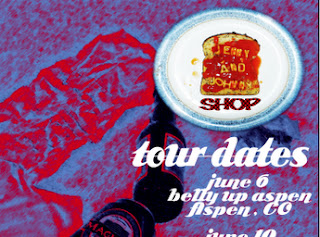
As you can see we used the same image of the spaghetti plate in our music video, web page and digi pack which links the three of them together and makes them recognisable as products of the same artist. We decided to use the spaghetti image as we thought that it fit with the fun, quirky image of our band and it also illustrated some of the lyrics from our song ("You used to dine out on a dollar...") Spaghetti on toast is generally regarded as a cheap meal but here it has a cute twist so we thought it would be a fun and visually interesting way to interpret the lyrics. It also reflects the narrative of our video as spelling out names in spaghetti is the kind of silly, romantic gestures people make in the fun, early days of relationships which we were trying to show in our video.
 |
| Images of our actors as Jenny&Johnny taken from our music video shoot and used on the front and back covers of our digi pack. |
 |
| Images of our actors as Jenny&Johnny taken from our music video shoot and used on the web page. |
 |
Our actors as Jenny&Johnny in our music video
We used similar images of our actors as Jenny&Johnny throughout our three products. We did this because we wanted our two ancillary products, the web page and digi pack, to reflect our main product, the music video. We thik we did this very effectively, particularly between the music video and the digi pack as the images on the front and back covers of the digi pack reflects the narrative of our music video. In our music video we see the story of a couple, Jenny&Johnny, who are initially very happy together but their relationship gradually breaks down throughout the video. This story is reflected on our digi pack as on the front cover the couple are sitting together on the bench which features in our video, looking very close and happy together, then, on the back cover, they are sitting far away from each other on the same bench and look very distant. |
Another theme that ran through both our music video and digi pack was photographs.
 |
Polaroid style photos on our digi pack
Burning photographs - Green scene effect used in our music video
We decided to use the polaroid effect on our digi pack because we thought that it fit in with Jenny & Johnny's slightly vintage image and it fit in with our video. We decided to include the green screen photographs in our video because they reflect the charecters "happier memories" and the narrative of the song and video. The burning of the photographs is supposed to show the break up of the two characters in the video in a way which would be fairly obvious to anyone watching it. We decided to include this visual clue as, because it is a music video, there is no dialogue between the characters to explain this.
|


No comments:
Post a Comment