Labels

Wednesday, 8 February 2012

Beth's Evaluation Question 2

2) How effective is the combination of your main product and ancillary texts?

We think the combination of our three products (music video, web page and digi pack) works really well together as we kept the same themes running continuously throughout all of them and kept a lot of the same motifs so they all related to each other.
For example, our three products relate together as we used some of the same imagery and themes which you can see below:
The famous alphabet spaggetti scene in our music video :)


Image of the spaghetti on our disc in the digi pack design.


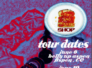
Spaghetti image on our web page

As you can see we used the same image of the spaghetti plate in our music video, web page and digi pack which links the three of them together and makes them recognisable as products of the same artist.  We decided to use the spaghetti image as we thought that it fit with the fun, quirky image of our band and it also illustrated some of the lyrics from our song ("You used to dine out on a dollar...") Spaghetti on toast is generally regarded as a cheap meal but here it has a cute twist so we thought it would be a fun and visually interesting way to interpret the lyrics. It also reflects the narrative of our video as spelling out names in spaghetti is the kind of silly, romantic gestures people make in the fun, early days of relationships which we were trying to show in our video.

Images of our actors as Jenny&Johnny taken from our music video shoot and used on the front and back covers of our digi pack.

Images of our actors as Jenny&Johnny taken from our music video shoot and used on the web page.
Our actors as Jenny&Johnny in our music video

We used similar images of our actors as Jenny&Johnny throughout our three products. We did this because we wanted our two ancillary products, the web page and digi pack, to reflect our main product, the music video. We thik we did this very effectively, particularly between the music video and the digi pack as the images on the front and back covers of the digi pack reflects the narrative of our music video. In our music video we see the story of a couple, Jenny&Johnny, who are initially very happy together but their relationship gradually breaks down throughout the video. This story is reflected on our digi pack as on the front cover the couple are sitting together on the bench which features in our video, looking very close and happy together, then, on the back cover, they are sitting far away from each other on the same bench and look very distant.
Another theme that ran through both our music video and digi pack was photographs.

Polaroid style photos on our digi pack

Burning photographs - Green scene effect used in our music video

We decided to use the polaroid effect on our digi pack because we thought that it fit in with Jenny & Johnny's slightly vintage image and it fit in with our video. We decided to include the green screen photographs in our video because they reflect the charecters "happier memories" and the narrative of the song and video. The burning of the photographs is supposed to show the break up of the two characters in the video in a way which would be fairly obvious to anyone watching it. We decided to include this visual clue as, because it is a music video, there is no dialogue between the characters to explain this.


Tuesday, 7 February 2012

Beth's Evaluation Question 1 - Web Page

1 - In what ways does your media product use, develop or challenge forms and conventions of real media products?
Web Page

We think our web page fits well for our artist as we used their signature colours to create it (red, black & blue) We used many of the conventions of alt/indie bands web pages but the page we created is actually very different to Jenny & Johnny's web page.


This is the webpage we created.

This is a link to Johnny and Jenny's web page.

As you can see Johnny and Jenny's web page is more of a blog and the colours are very plain, although the website is done entirely in their signature colours. We thought that their website was a little too plain and, frankly, boring, so when we did ours we decided we wanted it to a lot more colourful! We stuck with the theme of using the red, blue, black and white by altering one of our pictures in photo shop to these colours and using it as a theme throughout the rest of the page. We also included images of our band members on the page which is a conventional for this type of site and which Jenny&Johnny's page lacks. We did use Jenny and Johnny's blog idea a little when we included the news feed and twitter feed on our page. We also included links to twitter and facebook pages. Most bands now use twitter and facebook as they are now a vital marketing tool so we thought that it was really important to include these on our page.

This is a link to Jenny&Johnny's Facebook page.


Beth's Evaluation Question 1 - Digipack

1) In what ways does your media product use, develop or challenge forms and conventions of real media products?
Digipack

We think our digi pack fits well with both our song and artist. However, in many ways it is quite different to Jenny and Johnny's CD cover and other CD covers of our genre (Alt/Indie).

Front and back cover of our digi pack


Inside cover and disc of our digi pack


Jenny & Johnny's CD cover ("I'm Having Fun Now")

Our digi pack uses the conventions of alt/indie videos because it has a picture of the band on the cover. CD covers are supposed to advertise the band which is why it is important to have this picture on their. Jenny&Johnny's album cover also has a picture of them on it. Also, like on the Jenny&Johnny cover, our actors are close together on the cover which once again markets them based on their relationship. However, the colouring on the two covers is very different. On our digi pack we used lost of very bright, vibrant colours as we wanted it to stand out and have a very quirky, cartoon type look to it whereas Jenny&Johnny's CD cover is very dark. Their image is shown through a red filter which means the entire image is only in red and black. Jenny&Johnny's CD cover seems to be conventional of the genre as it is simular to other covers from this genre such as Belle & Sebastian's "If Your Feeling Sinister."


"If Your Feeling Sinister" - Belle and Sebastian

Because of this, our digi pack seems to challenge the conventions of our genre. This is because we based our digipack more on our music video rather than conventions.

Beth's Evaluation Question 1 - Music Video

1) In what ways does your media product use, develop or challenge forms and conventions of real media products?

Music Video

In the music video that we created for Jenny & Johnny's "Switchblade" I think we used a lot of the conventions of music videos in generally and conventions of indie/folk/alternative muic videos specifically. We didn't want to stray too far from these conventions as, obviously, our product needed to be recognisable as a music video and be suitable for the genre of our chosen artist.
As the embedding of Johnny and Jenny's other music video for the song "Big Wave" is disabled I have posted the link below:


There are many simularities between this music video and our own. One of these simularities is the fact that both videos feature a love story theme which reflects Johnny&Jenny's real life relationship.

Johnny & Jenny Love Story in our Switchblade video

Jenny & Johnny Love Story in their Big Wave video

We thought that this was an important element to include in our music video as when we did our research on Jenny & Johnny we found that they are generally marketed based on their relationship and it plays a big part in their overall image. Alternative love stories are also a major convention of indie/alt music videos.

As you can see in this picture, Jenny & Johnny's main "selling point" is usually their personal relationship.

Another way in which our music video uses the conventions of alt/indie music videos is the theme of rebellion that runs through most videos of this kind. When we did or research we discovered that most alt/indie videos feature some kind of alternative life styles which generally involves either sex, drugs, alcohol or all of the above.

In Johnny & Jenny's video for "Big Wave" there were some slightly sexual scenes


<><><><><>
However, as we didn't want to make our actors too uncomfortable we opted for alcohol instead :)

We also tried to use the conventions for these types of music videos when it came to both costume and location for our video.
Alt/indie artists generally have a very laid back, casual style with a slightly quirky twist. Johnny and Jenny are no exception to this. Their image is very casual but often has a subtle 50's influence.


 Johnny and Jenny - Casual style with a 50's twist in the "Big Wave" video


Casual style with a slightly vintage twist in our Switchblade video

However, unlike Jenny & Johnny, our actors had the great British weather to contend with and some of their style had to be sacrificed in order to keep warm! Still, I think our costume choices work well with the video and bring a little English charm to Johnny and Jenny's sunny Californian look :)

 The locations in alt/indie music videos is generally very naturalistic and outdoor so we decided to include this in our video by using the very visually affective Victoria Park.


Naturalistic locations in Jenny & Johnny's "Big Wave"
 Victoria Park archway in our "Switchblade" video


We also used conventions of music videos in general when it came to the technical aspects of our video, for example:
In music video's we expect to the band members, often with close up shots of them.
Close up shot of Jenny & Johnny in the "Big Wave" video

Our actors as Johnny and Jenny in our Switchblade video

Overall, I think we stuck pretty closely to the conventions for alt/indie videos and used a lot of our artists style. I think this makes our video suitable for the genre, the artist and the song. However, as Johnny and Jenny's Californian roots show through a lot in their image (the way they dress, sunny locations etc) our videos is bound to be slightly different as it was filmed in England in the middle of Winter. Therefore, I think we bought a little of our own British style to our video :)

Bronwyn's Filmed Evaluation

Monday, 6 February 2012

Question 3


After the deadline for editing our music video’s the class watched back everyone’s music video to give the groups feedback of how well we did and what our strong and weak parts were of our music videos. This was very interesting as we could compare how well we did against other people and it was a chance to see what we could get over all by filling in a questionnaire and putting a mark down what we would give them with the marking criteria in mind. The audience age was from 17 to 18 and was a mix gendered.  

Overall I’m happy with the feedback we got as it was mostly positive comments back. I was worried with what we might have got back; as I felt, as it was our class marking it they might be really harsh. But they all said similar things and gave pretty similar marks, which was good as everyone noised the same thing and was all on the same level. It was more over average, which is what we wanted.

They said the music video was
-Suitable for the song we did, as the conventions related to the genre and it suited the mood of the music being slow.
- Appropriate actors cast and costume.
- Good lighting
- Good locations fitted with the genre and story
-Kept you interested by having narrative and performance based.
-Shots were steady
-Well framed shots
-The effects were well done

The number one thing that people loved was the green screen effect of the paper being set on fire with the moving image. They weren’t sure how it work and said it looked quite professional and didn’t look tacky.


The negative feedback we got which I do agree on is:
-Some of the lip synching issue being out of synch
-Our actor’s hair being in his face too much was distracting and couldn’t see him singing.
-Shorter shots needed to keep attention going
-Actors to look more comfortable.
-More close up shots

I think we would have overcome more of these issues if we had followed the shot list better as it had more ideas in there we would have had more different shots. But I feel we did the best we could do and our feedback has been more positive.


Question 2

In the process of making the digipak and webpage, ideas kept changing and being developed but we always had the idea of having something fun and quirky. We kind of maintained the theme of having a dinner table set out with a home feeling of pictures, newspaper and a dinner plate (with Jenny and Johnny being spelt out in spaghetti). The overall idea of this came from the line in the song ‘used to dine out on a dollar’ we though we would interpret that line for the couple to have there own personal meaning behind it and have a recognising object of a slice of toast with alphabet spaghetti spelling something out. That idea helped us from the first design of the digipak on paper as we can see where the ideas started out. Also we knew that we wanted our product to be bright and colourful to grab audience attention, Photoshop would be useful to achieve this by changing the colours and contrast.  


What we have maintain through out the CD and Webpage

-Used very bright and colourful colours. To get the colours to stand out more, with the use of photoshop we were able to turn the contrast, brightness and colours up to get the effect we wanted. Gives a cartoon look.

-The layering effect is well maintain through out the CD cover and website which gives a 3D effect.

-Shows the quirkiness of the band     

When making the CD cover and webpage we show on both products the backgrounds being on a table cloth and having cut out lettering from magazines of the words ‘Switchblade’ or ‘Jenny’ and ‘Johnny’. Which connected them together and showed that quirkiness of the homey felling theme. But we do show a difference of the two products by the webpage main focus having a different theme and atmosphere to the CD cover. The reason for this was when using Photoshop a photo we took of the bottles on the floor looked very effective when altering the filters and colours and we wanted to show the conventions of the sex, alcohol and drugs by the image being bottles and cans which is a contrast between the two. 


We felt that Jenny and Johnny’s website could have been more interesting as well. It’s very simple but I do like how they’ve used their colours and there iconic snake.


From Jenny and Johnny’s music video they have used an image from ‘Big Wave’ for the front of there CD cover. And we did something similar of having our actors in our location of our music video for the image to go on our CD cover. This promotes the music video as well you can recognize where the image is from.  

  Official CD cover 'I'm having fun now' 

Image from music video
A shot of the CD cover with the picture of them in the locatio on the same bench we filmed at.
A shot from the music video same bench.