Question One: In what ways does your media product use, develop or challenge forms of convention of real media products?
In our music video Switchblade by Jenny & Johnny, we have used the conventions of an indie music video. These conventions are the use of low key lighting which we used while filming the house scenes. By not having bright light on our actors it created a casual not in your face kind of image. Other conventions are the use straight cuts, by keeping straight cuts in our video the pace of the song was kept at a steady rate. If we had been using different transitions the video wouldn’t have flown to the mood we created.
We added subtle changes to other conventions of indie music as our song had a folk twist to it. In folk videos, the artists appear very comfortable in front of the camera; this is something that our actors had trouble with and was something that was picked up in the feedback (question 3). By filming sections without them knowing the camera was on meant we filmed some casual shots of them without looking nervous.
In our video we have included many different shots, for example there are close ups as a note, mid close ups, long shots in the park which work really nice when filmed down the covered walk way. These are all conventions of indie music videos, the idea of the audience watching a band practice or similar is something that is used a lot in indie music videos. The image of a big scale production is rarely used as that doesn’t go along with the casual image of indie music.
 |
| A nicely framed shot with perspective angles. |
However my favourite shot of the video was as talked about in my 'mini review' was the hand held section in the house with the spaghetti that included a rather nice point of view shot. We used a few handheld shots that worked really well and fit in with the music. We thought about filming everything on a tripod but the effect of handheld shots gave the audience the thought that those shots were being filmed by the actors while having fun which was a element we wanted to create aswell as the love story mood.
The mise en scene of our actors and locations were easily achieved as Jenny & Johnny appear to like filming in natural surroundings while looking natural themselves so there wasn't any need for snazzy locations or over the top costumes. This is because their music is that of a homely feel, this way putting on a big show wouldn't have been appropriate for this genre or song. The mise en scene of our actor’s figure expressions we thought about. While our actors we playing their guitars by having them lightly head banging and having a uncaring facial expression. This is because they know that what the song is leading to at the end. The overall appearance of our actors was created by wearing black, red and dark blue coloured clothes. By having them wearing boots instead of skater shoes the convention of indie music footwear was changed but as the band have a slight folk image to them the use of boots created that look.
 Our Digipak doesn’t conform to the conventions of a usual indie Digipak as our actors are seen on the front and back of the cover. We used our actors image on the cover to illustrate the relationship between them which wouldn’t have been noticeable had we used for example the inside covers of the Digipak. Initially the front cover was going to be the CD insert cover. This shows the image of the spaghetti reading “Jenny and Johnny” on the toast. This is a feature in our video during a house scene and plays with a lyric “dine out on a dollar”.
 |
| Point of view shot |

Our webpage shows the artists or in our case the actors appear to sit on different words on the webpage to give the webpage a fun feel, to stride away from a formal looking plain layout blog like Jenny and Johnny have presently as their webpage. We had a sort of two layer approach to our webpage, the base layer had the table cloth with the name of the song partially hidden and the artists name around the main layer of the webpage. The letters of the song name and the artists name are in the same style that was used on the Digipak to keep the same conventions and look of that.
Jenny and Johnny - Big Wave Music Video
In the video linked above the location sat in the street in front of the car is used quite regularly throughout the duration of the song. We used this idea by having our Johnny sat on a bench in the park and we came back to this shot throughout our video. In this song, Jenny is the one who is singing the most and she is seen in various costumes in multiple locations. This is something that we couldn't do due to logistics and other reasons. However the locations and costumes that we used are similar to those that Jenny and Johnny use themselves. There a few similarities in the two videos. Jenny and Johnny are known for having a very good friendship and one that is intimate. This is shown in shots of them kissing and laying on the floor together. We were lucky that are actors were in a relationship so they were happy to do kissing scenes.
 |
| Our actor playing the chorus and looking away from the camera |
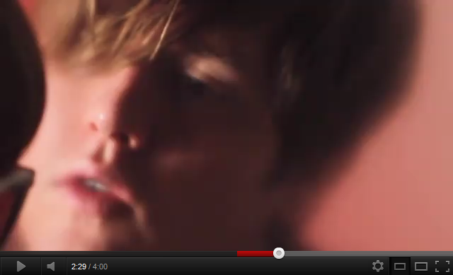 |
| Johnny looking away from the camera while mid chorus |
 |
| Jenny singing to Johnny in a shot together |
 |
| Johnny singing to Jenny in a shot together |
 |
| Biker image while performing |
In our video we didn’t want to portray the biker image as we wanted a different tone to that for our song. The tone we wanted was the love image and this is often seen in a biker image as they are often seen to be big and scary. By having casual clothing with biker boots this used a small section of their biker image while with keeping with the indie love look.
While creating the webpage using iWeb, I was unsure of how to add hyperlinks onto the page as we had imported a flat image from Photoshop as I found working in Photoshop easier. The only downside is that I had to create all the links in iWeb. I looked on Youtube for a tutorial and followed the following one and the hyperlinks worked.
While creating the webpage using iWeb, I was unsure of how to add hyperlinks onto the page as we had imported a flat image from Photoshop as I found working in Photoshop easier. The only downside is that I had to create all the links in iWeb. I looked on Youtube for a tutorial and followed the following one and the hyperlinks worked.


